A Fresh Take on the Master Bedroom – pt. 1
It’s no secret that our new home was extremely busy when it came to ‘the bold and the outrageous’ color scheme throughout. Managing to be both unflattering and non-complementary in one fell swoop we felt as though each room had been sealed away from the whole. That left us with a myriad of odd and questionable taste within the confusion of color as far as the eye could see.
To be fair, despite the menagerie of colors it still held a punch of personality (not ours) versus that of the numerous ’50 Shades of Beige’ we’d seen while touring homes for sale. However, disjointed chaos is the best way I can think to describe the feeling evoked when walking from one end of the house to the other.
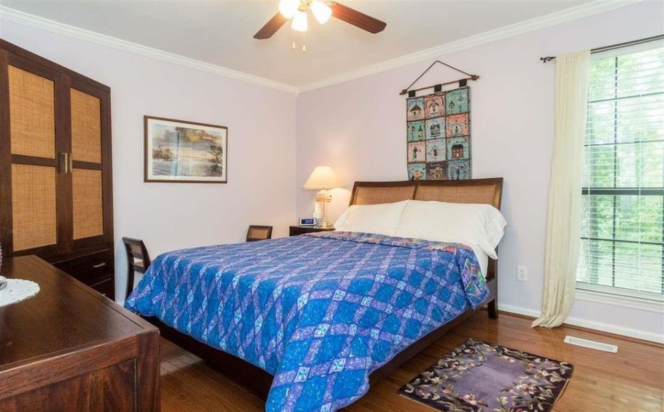
Determined to get started on injecting our personality into the house, we began with a farewell to the sad lilac hue in the original master bedroom. I cannot express enough just how dreary that color made the room feel and consequently I haven’t been that enthused about a trip to Home Depot to pick out paint colors in some time.
In the past we’ve generally shied away from feature walls in a room unless re-imagining our living room but I wanted to cast off from our safe pale toned blue-grey neutral palette and add a punch of our own to the room.
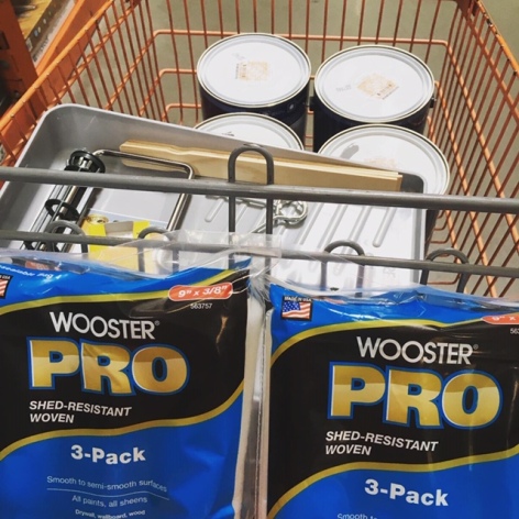
First step, goodbye lilac. We started with a fresh slate by painting the entire room in Decorator’s White by Benjamin Moore to lighten and revive the room. It was amazing what a difference just casting off the lilac made – you could actually realize the square footage of the room again.
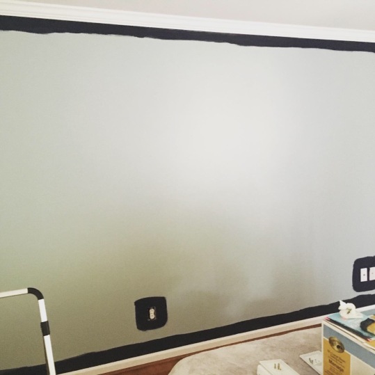
Confession time. Despite my big talk of BOLD color choices, I lost my nerve when the time came and played it safe, falling back on an old favorite in Beach Glass by Benjamin Moore for our accent wall color. Now while we both enjoyed it, we realized how quickly the color would disappear into the patterns and textures we’d chosen for our room.
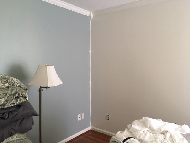
Now in my head, I’d envisioned a floor-to-ceiling feature wall of either custom built-ins or extra wide horizontal planks with wall sconces set against the cool-tone white walls set with a modern take on wainscot paneling. Though beautiful, Beach Glass felt a touch underwhelming for the statement we’d been preparing ourselves to make.
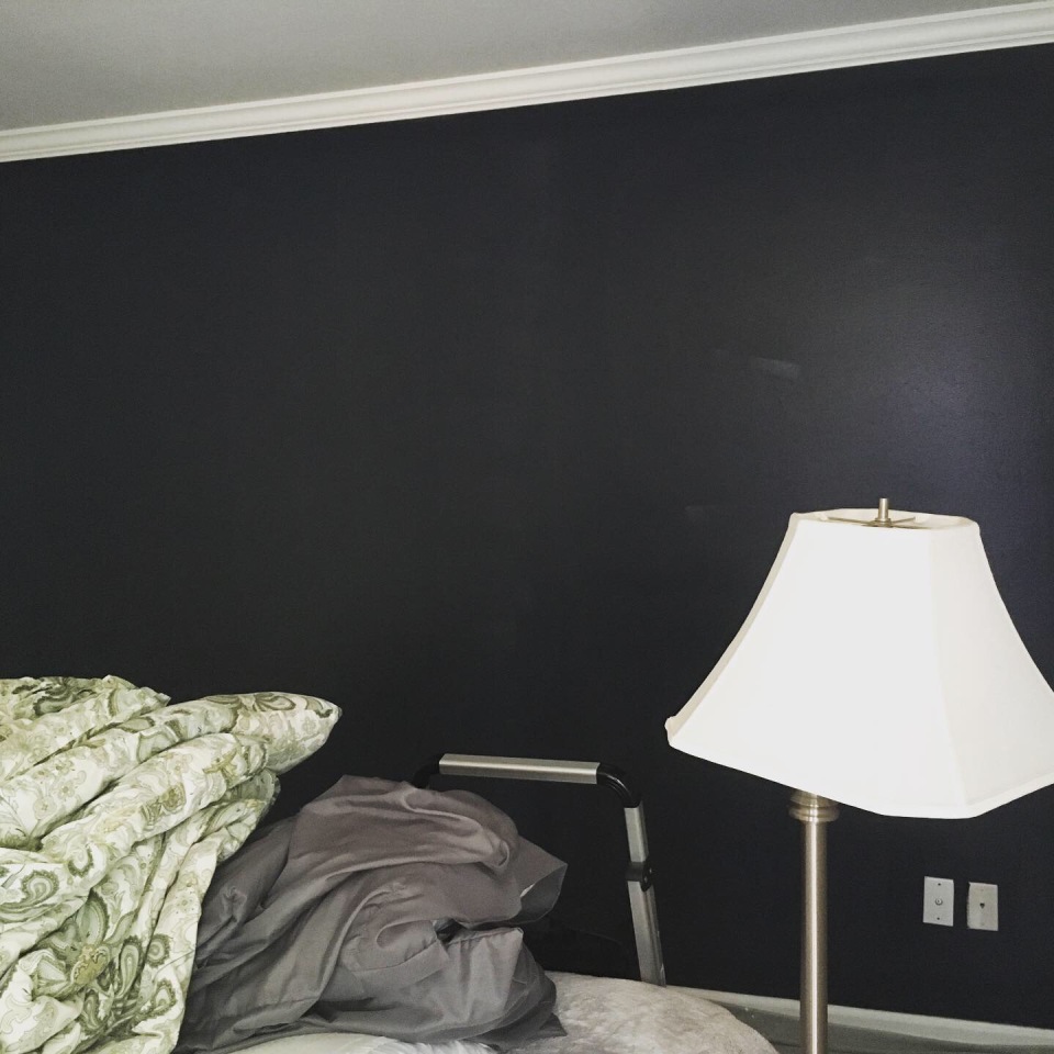
With my co-conspirator, Parkside Twin, encouraging me to take the plunge, I snuck the Hale Navy out from behind our supplies and simply went for it. It should be known that a mid-tone blue or pewter is about as “bold” as I’ve ever attempted… the sheer depth of Hale Navy was utterly terrifying as I rolled it on. For those who have fallen in love with it, as we now have, you should know…it does not lighten as it dries, if anything the color only became all the richer.
First step down…only two, no three…err at least five more to go before seeing this room come to fruition. But as the paint dries and the sun is setting outside, here’s to taking the plunge.
Cheers!
~Christy